Research thought the topic of grace and perry. Of what work relates to mine. None of it dose. Due to the work on grace and perry is a different identity to mine. The Work on grace and perry is more antique artefacts unlike mine is more modern. The work on the grace and perry feature. Is more than just drawing/ illustration work. It is more antique work. With 1700 style patterns on. And on the grace and perry saatchi gallery. Features hand crafted pottery. And greyson perry being an artist as well who works on material arts. And in other words grayson perry is a textitles surface artist unlike a illustator etc.
Conclusion
My works no relation to grace and perry because. Mine is illustration on the visual arts side were as grace and perry's, is material arts.
Biblography
http://www.saatchigallery.com/artists/grayson_perry.htm
http://www.dailymail.co.uk/news/article-2545301/Cross-dressing-artist-Grayson-Perry-wears-mother-bride-outfit-receive-CBE-Prince-Charles.html
https://www.youtube.com/watch?v=vVZR_pFJfyc
Thursday, 1 January 2015
Monday, 15 December 2014
Symbolism and Colour
Definition
Colour is another part to symbolism as it can reperest different things and gives art work it's symbolism though the colour theory. Colour can represt a meaning, gender has a colour representation and age.
Looking at symbolism and colour. Thought i'd pick an illustrator i inspire Jack Teagle.
Shown below an example of Jack Teagles work. The first bit of symbolism on there is that there are peopl and superheros. I like the colour pallute jack teagle uses in particular the flat colour backgrounds Jack Teagle uses. Which fit in good with his block colour style. On the right is some of Jack Teagles comic work. Which Jack Teagle uses a lot of black and white amongst his style in his comics. The Symbolism of the comic image is 2 weirid charactors fighting in a storm. Like the use of black and white on that image. And i like were jack teagle has given the symbol of the storm by using smoogey watercolour paint to make the symbol of clouds off different shades.


Figure 3 - http://www.clichemag.com/katy-jade-dobsons-wild-life/ 15/12/14
Figure 4 - http://www.clichemag.com/katy-jade-dobsons-wild-life/ 15/12/14
Colour is another part to symbolism as it can reperest different things and gives art work it's symbolism though the colour theory. Colour can represt a meaning, gender has a colour representation and age.
Looking at symbolism and colour. Thought i'd pick an illustrator i inspire Jack Teagle.
Shown below an example of Jack Teagles work. The first bit of symbolism on there is that there are peopl and superheros. I like the colour pallute jack teagle uses in particular the flat colour backgrounds Jack Teagle uses. Which fit in good with his block colour style. On the right is some of Jack Teagles comic work. Which Jack Teagle uses a lot of black and white amongst his style in his comics. The Symbolism of the comic image is 2 weirid charactors fighting in a storm. Like the use of black and white on that image. And i like were jack teagle has given the symbol of the storm by using smoogey watercolour paint to make the symbol of clouds off different shades.

Figure 1 Figure 2
Katy Dobson
Another artist that uses quite a lot of colour in her work is Katy Dobson. The Colour use on Katy's work represents gender by. The use of colourful mixed oil paint. Were it is normally female artists use bright colours. Katy uses colours in the way of representing the symbolic atmosphere of the situation. Like on figure 3 were it is horses running out of water Katy has used shades of blue from light to dark to represent the splashes from the horses running in water.
Figure 3 Figure 4
Bibliography
Figure 1 - http://artlanguagepart2-samthorne.blogspot.co.uk/2012/04/jack-teagle.html 15/12/14
Figure 2 - http://meathaus.com/2009/05/= 15/12/14
Figure 3 - http://www.clichemag.com/katy-jade-dobsons-wild-life/ 15/12/14
Figure 4 - http://www.clichemag.com/katy-jade-dobsons-wild-life/ 15/12/14
Tuesday, 2 December 2014
Gendering the image
Gendering my own work:-
Gendering that my work represents it's a males work and not a females. The use of black black ink is mostly used by males. Were i normally imagine girls work as bright and colorful. And the things and the tools i use for drawing are different in ways to which some females would use. Such as shapie pens you tend to see more male illustrators use sharpie pens than females. I normally see femlaes work mostly colourful but not always and more females tend to use pencil or paint more often.
On my work how I could visualize that it is been done by a male. Which is a tricky task because it my own work and that is a hard comment to assist on making because it's what i'd visualise on what i could imagine others thinking or going though there mind when they see my work from 3rd person point of view. I could visualise that people think my work has been done by a male by how crowded and full my work is. My sketchbooks being a mess and thick bold line. Were most females would be more organised in there sketchbook and have things tidier.
My Graphic novel work has standing out to be a males due to most the work being big. And more importantly on the graphic novel side is the language and humor used. Which you can imagine from a males graphic novel there would be a few swear words because it used to be said that males swear more than females.
Few examples of my own work!!!!


A spread in my sketchbook


Conclusion
After gendering my own work. The conclusion i'd give is that when people look at some work there would first more just admire the work and then maybe start thinking who it was done by. People debate on how I have gendered my work, if i was to stand up and talk about that I would get the comments such as. "i use sharpies and i'm a girl" and people would start naming female artists who work in similar ways to me such as colour etc. Which in ways guessing the work has been done by one sex can somtimes be wrong.
Sunday, 30 November 2014
Self-identity and the creative voice - week 9
By Looking at my own work my idenity of my creative voice defines by my style. To people reasoning my work and noticing it is my work without having to look at the name of the artist. So when people see my work there could tell it is done straight away by me.
Which of my illustrations identify me and my work!!!!
Thinking on third persons thoughts of my work identifying is quite a hard one, considering I have to think how other may describe me and my work. But one of my well known piece's of work i have been known for by other around the uni is my people and characters exhibition. As i have heard people describe me as the one who done the wall of faces.


Overall I would put in my portfolio my best and most proud of work, exhibitions I have exhibited on. I would order my portfolio to give a good first impression of my work. If my portfoilio was set out to go for an interview i would plan how i'm going to talk about my work and prepare to answer any questions there may ask.
Conclusion
My work has already has it's own identity, as being done by me. My line style stands out well as being my own work. Which identifies me as an illustrator,
Which of my illustrations identify me and my work!!!!
Thinking on third persons thoughts of my work identifying is quite a hard one, considering I have to think how other may describe me and my work. But one of my well known piece's of work i have been known for by other around the uni is my people and characters exhibition. As i have heard people describe me as the one who done the wall of faces.
My T-shirt which have been getting sold by me. I'm am also identified for doing.
My comic work has a big identity of being my work by the style of charactors, layout of the comic panel and the use of colour. I.e my use of black and white.
Conclusion
My work has already has it's own identity, as being done by me. My line style stands out well as being my own work. Which identifies me as an illustrator,
Friday, 28 November 2014
The Retro Youth Culture - Week 3
Looking back at the 1960s 70s and 80s. The Youth culture in them days such as Music, Fashion etc.
 Figure 1
 figure 2
The Beatles
The Beatles are famous 1960s and 70s Rock band. The Beatles were a band of 4 men from Liverpool. With the 2 lead singers being John Lennon and Paul McCartney, down with George Harrison and Ringo Star.
 Figure 3
 Figure 4
For both them bands
The Concept - would have been related to the bands music, in the way their preform it and to the sound of the music.
Marketing -
Cultural change - The youth culture has now changed much since the days of the beatles and the rolling stones. Bands have changed in ways from style actions and dress style. Figures below show the change of style from present bands Figure 5 one direction figure 6 Union J. And further below Figure 7 and 8 show 2 retro bands the beatles figure 7 and the rolling stones figure 8. There is the change of style from both the present bands to the retro bands. The Hair style is a difference now were it is either short and spikes or thick and wavey and ware mostly denim jeans and hoodies as there fashion apparel. Unlike the rolling stones and the beatles whcih all had shoulder length hair and wore black suits as there fashion apparel.
 Figure 5
  Figure 6
 Figure 7
  Figure 8
Bibolography
Quotes
[1] http://www.rollingstones.com/band/ 10/11/14
[2] http://blessingsfromhome.com/beauty/musical-muses-fashion-inspired-by-the-beatles/
Images
Figure 1 - http://genius.com/artists/The-rolling-stones 28/11/14
Figure 2 - http://www.iorr.org/tour02/40licks.htm 28/11/14
Figure 3 - http://www.fanpop.com/clubs/the-beatles/images/14620668/title/beatles-fanart 28/11/14
Figure 4 - http://lueb-art.deviantart.com/art/The-Beatles-292984158 28/11/14
Figure 5 - http://musically.com/2014/11/28/one-direction-h1deninspotify/ 28/11/14
Figure 6 - http://www.funkidslive.com/news/get-yours-union-j-dolls-are-out-right-now-jaymi-hensley-josh-cuthbert-jj-hamblett-george-shelley/ 28/11/14
Figure 7 - http://www.thebeatles.com/news/beatles-are-itunes-radio- 28/11/14
Figure 8 - http://www.funkidslive.com/news/get-yours-union-j-dolls-are-out-right-now-jaymi-hensley-josh-cuthbert-jj-hamblett-george-shelley/ 28/11/2014
Other links
http://courses.music.indiana.edu/rock/birthplaces.html
http://www.thebeatles.com/
The Rolling stones
Figure 1
The Rolling stones was a band of 6 people that [1]began playing gigs around London 1962[1]. The 6 members of the band were Mick Jagger, Keith Richards, Brian Jones, Ian Stewart, Dick Taylor and Tony Chapmann.
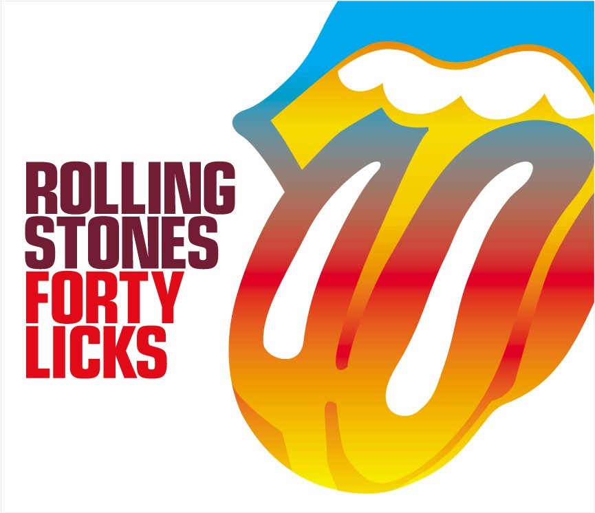 figure 2
One of the Rolling stones albums 40 licks, this album contained 40 album tracks. The Concept on the design of the album cover FORTY LICKS is the huge tounge sticking out using mostly the RGB colours which were used on a lot of products in the 70s and 80s. The album that gets the name forty licks due to containing 40 album tracks was released in September 2002. But the market would have been older people more than youths. As the rolling stones started in the 1960s so not many youth's would have listened to them.
The Beatles
The Beatles are famous 1960s and 70s Rock band. The Beatles were a band of 4 men from Liverpool. With the 2 lead singers being John Lennon and Paul McCartney, down with George Harrison and Ringo Star.
Figure 3
The Beatles were a rock band known for their fashion of [2]Wearing bold and bright military jackets and sporting longer hair and mustaches, they completely reinvented their image and created trends all over the place. [2]
Figure 4
Poster shown figure 4 of the beatles it's concept is representing how the beatles would preform, play instruments, and dress and represent their music. The Concept towards it being rock is the band members playing the guitars which represents their music. And the concept of the colours on the image is to represent the colours their where is all the bright parts to the image.
For both them bands
The Concept - would have been related to the bands music, in the way their preform it and to the sound of the music.
Marketing -
Cultural change - The youth culture has now changed much since the days of the beatles and the rolling stones. Bands have changed in ways from style actions and dress style. Figures below show the change of style from present bands Figure 5 one direction figure 6 Union J. And further below Figure 7 and 8 show 2 retro bands the beatles figure 7 and the rolling stones figure 8. There is the change of style from both the present bands to the retro bands. The Hair style is a difference now were it is either short and spikes or thick and wavey and ware mostly denim jeans and hoodies as there fashion apparel. Unlike the rolling stones and the beatles whcih all had shoulder length hair and wore black suits as there fashion apparel.
Figure 5 Figure 6 Figure 7 Figure 8Bibolography
Quotes
[1] http://www.rollingstones.com/band/ 10/11/14
[2] http://blessingsfromhome.com/beauty/musical-muses-fashion-inspired-by-the-beatles/
Images
Figure 1 - http://genius.com/artists/The-rolling-stones 28/11/14
Figure 2 - http://www.iorr.org/tour02/40licks.htm 28/11/14
Figure 3 - http://www.fanpop.com/clubs/the-beatles/images/14620668/title/beatles-fanart 28/11/14
Figure 4 - http://lueb-art.deviantart.com/art/The-Beatles-292984158 28/11/14
Figure 5 - http://musically.com/2014/11/28/one-direction-h1deninspotify/ 28/11/14
Figure 6 - http://www.funkidslive.com/news/get-yours-union-j-dolls-are-out-right-now-jaymi-hensley-josh-cuthbert-jj-hamblett-george-shelley/ 28/11/14
Figure 7 - http://www.thebeatles.com/news/beatles-are-itunes-radio- 28/11/14
Figure 8 - http://www.funkidslive.com/news/get-yours-union-j-dolls-are-out-right-now-jaymi-hensley-josh-cuthbert-jj-hamblett-george-shelley/ 28/11/2014
Other links
http://courses.music.indiana.edu/rock/birthplaces.html
http://www.thebeatles.com/
Friday, 21 November 2014
Illustration as an Object
Illustration to the objects are illustrators which have been formed in to objects. Such as toys, from illustrated charactors. For example a statue of bart simson is illustration as an object. Because Bart Simpson is originally a illustration for cartoons/comics and since it became popular it got made as toys. And overall illustrations can be done on many differnt products. Tshirts are another type of illustration as an object. Image in the middle is a t-shirt i illustrated as part of a brief i was working on. And that tshirt was for a band. But illustration can be formed on many different objects, such as toys, cushions etc.


Made into an object from illustration is this cat formed from different shaped photographs to form a collarge. Collarges are illustrations as objects. Due to it has normally been collarges normally a form of cutting outs formed to make an image. Which is still classed as drawing because your forming a image.

Biblography
http://helpx.adobe.com/illustrator/using/combining-objects.html
http://www.shapecollage.com/
Made into an object from illustration is this cat formed from different shaped photographs to form a collarge. Collarges are illustrations as objects. Due to it has normally been collarges normally a form of cutting outs formed to make an image. Which is still classed as drawing because your forming a image.
Biblography
http://helpx.adobe.com/illustrator/using/combining-objects.html
http://www.shapecollage.com/
Tuesday, 18 November 2014
The Golden age of illustration - week 2
The Golden age of illustration, illustrators in the late 1800s to the early 1900s.

Born in London in 1872 William Heath Robinson was a illustrator/cartoonist in the first world war. Heath Robinson has been described as [1]the man behind the name[1] with his famous history as a cartoonist. William was born into a family of artists in 1872 and from and 1887 he went and studied and islington school of art. He wanted to become a landscape painter but after that he had gone in to doing book illustration.

William Heath Robinsons came known as a gadget king and his cartoons settled the beliefs of what marked the 20th century, such as 20th centurary industrial workers. Figure 1 showing the industrial workers out at sea in the 20th centuary.
The wrok by william heath robinson below is representing the coloussus which was the worlds first ever computer. In the 20th centuary used by the british colledbreakers at bletchery park. William had produced the cartoon on this with over 2000 charactors.


Chris riddell an illustrator who was born in cape town, South Africa to British parents before moving to back to England when Chris was 1 year old Chris Riddel studied at University of Brighton. Since Graduating Chris Riddell has became a british illustrator and illustrated 13 different books. The books Chris Riddell has illustrated are The Empour of Absurdia, The ottoline book series. Ottoline and the yellow cat, ottoline goes to school, Ottoline at Sea. And Wendel's workshop CD, Wendel's Workshop, Mr Underbed, Alienography or how to spot an alien invasion and what to do about it, mr underbed, goth girl and the ghost of a mouse. And aswell as Chris Illustrating his own books chris has also illustrated books for authors such as Neil Gaiman.


Dave Mckean


Dave has illustrated over 40 graphic novels such as 9-11 which was based on the terrorist attackings in september 2001. And the oth Dave has worked on Freak show, Rolling stones, dark horse the list can go on. But Dave Mckean had produced a series of graphic novels which was The Sandman series. Whcih consisted to over 20 books. Aswell as working on The Dreaming Comic covers and having 60 of them comics published.


Through out Dave Mckeans career as he had work on editorial for Magazines and Magazine covers. Using both his Illustration and photography Dave Mckean produced imagery for magzines, such as interview editorial and some graphic novel magazines such as the new yorker. Dave had used his photography skills producing human figure photography for magazine covers such as Q magazine, Go, Rolling Stones, D Side, DreamWatch, List can go on he used his graphic design knowledge and photography to produce the front covers for them magazines.


Biblography
http://heathrobinson.org/index.htm
http://en.wikipedia.org/wiki/W._Heath_Robinson
http://www.wired.co.uk/news/archive/2013-07/29/heath-robinson-deserves-a-museum
https://www.youtube.com/watch?v=SMqjyynNYaM
http://www.bbc.co.uk/history/historic_figures/robinson_william_heath.shtml
http://www.loyalbooks.com/book/Bill-the-Minder-by-W-Heath-Robinson
http://en.wikipedia.org/wiki/Chris_Riddell
http://www.theguardian.com/profile/chrisriddell
http://www.chrisriddell.co.uk/
http://www.lovereading4kids.co.uk/author/1223/Chris-Riddell.html
https://www.pinterest.com/banderbear/chris-riddell/
http://www.parentingwithouttears.com/articles/GraveyardBook
http://en.wikipedia.org/wiki/Dave_McKean
http://www.davemckean-collector.co.uk/page_833188.html
quotes
[1] http://www.wired.co.uk/news/archive/2013-07/29/heath-robinson-deserves-a-museum
[2] http://www.bbc.co.uk/history/historic_figures/robinson_william_heath.shtml
William Heath Robinson
Born in London in 1872 William Heath Robinson was a illustrator/cartoonist in the first world war. Heath Robinson has been described as [1]the man behind the name[1] with his famous history as a cartoonist. William was born into a family of artists in 1872 and from and 1887 he went and studied and islington school of art. He wanted to become a landscape painter but after that he had gone in to doing book illustration.
[2] By 1899, he had illustrated an edition of Cervantes' 'Don Quixote', and another of 'The Arabian Nights'. In 1900, he illustrated an edition of the poems of Edgar Allan Poe, and in 1902 he wrote his first book, 'The Adventures of Uncle Lubin', for the first time enjoying complete artistic license. He also worked on an edition of the writings of Rabelais, and published another book, 'Bill the Minder', which was an enormous success. [2]
Bill the minder by william heath robinson.
William Heath Robinsons came known as a gadget king and his cartoons settled the beliefs of what marked the 20th century, such as 20th centurary industrial workers. Figure 1 showing the industrial workers out at sea in the 20th centuary.
The wrok by william heath robinson below is representing the coloussus which was the worlds first ever computer. In the 20th centuary used by the british colledbreakers at bletchery park. William had produced the cartoon on this with over 2000 charactors.

Chris Riddel
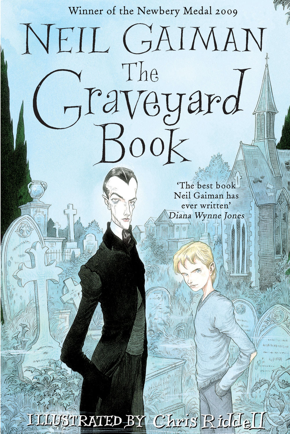
Chris riddell an illustrator who was born in cape town, South Africa to British parents before moving to back to England when Chris was 1 year old Chris Riddel studied at University of Brighton. Since Graduating Chris Riddell has became a british illustrator and illustrated 13 different books. The books Chris Riddell has illustrated are The Empour of Absurdia, The ottoline book series. Ottoline and the yellow cat, ottoline goes to school, Ottoline at Sea. And Wendel's workshop CD, Wendel's Workshop, Mr Underbed, Alienography or how to spot an alien invasion and what to do about it, mr underbed, goth girl and the ghost of a mouse. And aswell as Chris Illustrating his own books chris has also illustrated books for authors such as Neil Gaiman.
3 Of Chris riddell books


Chris Riddells books were illustrated for children. And Chris has been rewarded the Nestle Childrens book award for 2006. Showing in the images below Chris Ridell had used nice colouring in his work which he mostly used indian ink to produce the colour. And his book have a good sate of humour and style which children love. And Chris had his first book published in the 1990s.
Chris Riddell video showing how he produced his work. WIth the tools he uses and the inks in his style.
https://www.youtube.com/watch?v=DSMEGblE0sw
A book worked on by chris riddell and Neil Gaiman.
Dave Mckean
Dave Mckean an English Illustrator, Comic Book artist, Graphic Designer and Film Maker, and photographer. Dave was born in Maidenhead in 1963 Dave had designed and illustrated book covers, Graphic Novel's, Cd Covers, Magazine Illustration, Films and DVDs and had produced fine art paintings and drawings and photography.
Shown on the figures below Dave Mckean's commission artwork. Dave is a well popular artist with a really good painting style. Where to form the textrure Dave Mckean used bits of stuck on paper to the paper to form the texture then paiting over with ink and forming a smudgey type paint mix. Which makes daves work interesting.
Some Of Dave Mckean's commission work

Dave has illustrated over 40 graphic novels such as 9-11 which was based on the terrorist attackings in september 2001. And the oth Dave has worked on Freak show, Rolling stones, dark horse the list can go on. But Dave Mckean had produced a series of graphic novels which was The Sandman series. Whcih consisted to over 20 books. Aswell as working on The Dreaming Comic covers and having 60 of them comics published.
Four of the many graphic novels Dave Mckean had Produced
Dave Mckean also had a filming career. And had produced up to 20 different films. such as The Balled of Buckethead, Footloose NYC, Lowecraft 1 and Izzy.
Some of the films and DVD's Dave mckean had produced

Through out Dave Mckeans career as he had work on editorial for Magazines and Magazine covers. Using both his Illustration and photography Dave Mckean produced imagery for magzines, such as interview editorial and some graphic novel magazines such as the new yorker. Dave had used his photography skills producing human figure photography for magazine covers such as Q magazine, Go, Rolling Stones, D Side, DreamWatch, List can go on he used his graphic design knowledge and photography to produce the front covers for them magazines.


Biblography
http://heathrobinson.org/index.htm
http://en.wikipedia.org/wiki/W._Heath_Robinson
http://www.wired.co.uk/news/archive/2013-07/29/heath-robinson-deserves-a-museum
https://www.youtube.com/watch?v=SMqjyynNYaM
http://www.bbc.co.uk/history/historic_figures/robinson_william_heath.shtml
http://www.loyalbooks.com/book/Bill-the-Minder-by-W-Heath-Robinson
http://en.wikipedia.org/wiki/Chris_Riddell
http://www.theguardian.com/profile/chrisriddell
http://www.chrisriddell.co.uk/
http://www.lovereading4kids.co.uk/author/1223/Chris-Riddell.html
https://www.pinterest.com/banderbear/chris-riddell/
http://www.parentingwithouttears.com/articles/GraveyardBook
http://en.wikipedia.org/wiki/Dave_McKean
http://www.davemckean-collector.co.uk/page_833188.html
quotes
[1] http://www.wired.co.uk/news/archive/2013-07/29/heath-robinson-deserves-a-museum
[2] http://www.bbc.co.uk/history/historic_figures/robinson_william_heath.shtml
Subscribe to:
Posts (Atom)